
Built a scalable design system for a student risk management platform, reducing component sprawl, improving design-to-development alignment, and cutting implementation time by 50%.
ISOLVRISK
Project overview
Goal:
Establish a single source of truth for components and patterns to make the product more consistent, efficient, and easier to scale.
My role:
Lead Product Designer driving design systems, product strategy, UI design, and custom illustrations.
Team:
2-person core team consisting of myself and the Lead Engineer, with collaboration from full-stack developers and the Head Designer.
Responsibilities:
Design systems, product strategy, UI design, discovery, cross-functional collaboration, and custom illustrations.
Timeline:
6 months
Cetegory
Edtech
Tools
Figma, Jitter, Adobe Illustrator, Paper & pencil
Impact on product and team
120+ → 50
Reduced component variations into reusable patterns
4 weeks → 2 weeks
Cut implementation time by 50%
2 hours / week saved
Reduced meeting and QA time
Why the product needed a system
iSolvRisk helps students think through everyday decisions and long-term career paths by visualizing potential outcomes.
As new features were added, the product became less consistent and harder to maintain. Components were recreated across screens, design intent was often lost in handoff, and visual patterns were not applied in a predictable way. What looked like isolated UI issues were actually system-level problems affecting speed, collaboration, and product quality.
This project was not just about cleaning up screens. It was about creating structure that would help the team work more efficiently and make the product easier to grow over time.
What was breaking at scale

Process
iSolvRisk helps students think through everyday decisions and long-term career paths by visualizing potential outcomes.
As new features were added, the product became less consistent and harder to maintain. Components were recreated across screens, design intent was often lost in handoff, and visual patterns were not applied in a predictable way. What looked like isolated UI issues were actually system-level problems affecting speed, collaboration, and product quality.
This project was not just about cleaning up screens. It was about creating structure that would help the team work more efficiently and make the product easier to grow over time.

Problems
No single source of truth for components
Both teams recreated or interpreted components differently, leading to UI inconsistencies. Poor communication and handoff process
Misalignment between designers and developers
Designers felt their intent was misunderstood; developers described it as a “game of broken telephone.”
Working in silos
Limited collaboration led to assumptions being made instead of clarifying, resulting in inefficiencies and rework.
Advocated for a design system to cccelerate delivery.
The team was focused on shipping features, but inconsistent UI and a lack of documentation led to design and dev inefficiencies. I defined a shared mission and advocated to the CEO using audit findings and team feedback. By highlighting the impact on velocity and product quality, I secured executive buy-in and carved out roadmap space. This laid the groundwork for a unified design system that improved consistency and accelerated delivery.
I started by defining a mission to align the team toward a common goal.
Mission statement
Empowering the product team to support current and future products by enhancing UI consistency and fostering seamless collaboration between designers and developers.
Conducted and documented an inventory of every UI element to gain insight into the current status of existing design elements.
I identified many inconsistencies in our design assets, highlighting the need for a more systematic approach to documenting, communicating, and setting up our design system.


Typography
Typography lacked hierarchy, with inconsistent fonts, sizes, and weights disrupting readability.
Colors
Colors were inconsistently applied, affecting brand identity and accessibility.
Components
Components lacked uniformity in styles and descriptions, making design cohesion difficult to maintain.
I identified inconsistencies in typography, layout, and navigation to shape the redesign strategy.

I redesigned the UI to support rebranding, enhance usability, and engage users through the use of illustrations.
At the CEO’s request and after uncovering key UI issues, I redesigned the interface to incorporate custom illustrations and a clear visual hierarchy. I selected this illustrative, minimalist style to spark curiosity, reduce cognitive load, and create an emotionally engaging experience. It aligns with the refreshed brand and space-themed narrative while supporting a more usable, accessible, and scalable product.


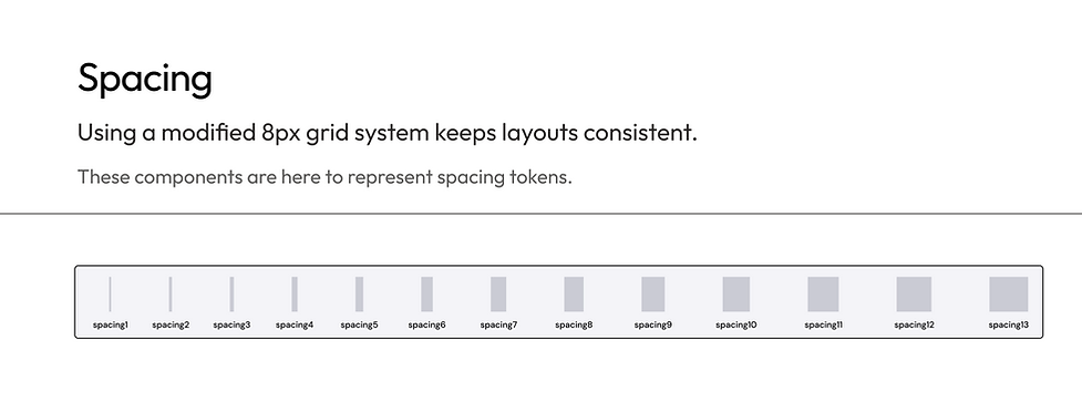
I built scalable design foundations from the ground up to ensure visual consistency with a custom token system.
After tidying things up, it was time to lay the foundations of our design system.
Ensuring a clean, consistent, and scalable design system that was uninfluenced by existing or outdated components.
These tokens defined the app's core visual language, ensuring consistency across UI components and enabling easier handoff to developers. Designers could use these guidelines to create new components (as seen in the images above) and expand the design system further. Here are some foundation pages that keep the team aligned.


I designed component architecture in Figma using a systematic approach from properties to variants.
Here is the process I followed when creating any components.
Examples

From atoms to a page. Why atomic design?
I created an atomic design system based on Brad Frost’s methodology to bring consistency and scalability to our product. By structuring components into atoms, molecules, organisms, templates, and pages, we reduced UI inconsistencies, improved team alignment, and accelerated development with reusable building blocks.

Turned chaos into clarity: lessons learned from auditing and building a scalable design system.
Within 5 months of assuming my role, we successfully built the design system in Figma from scratch, resulting in significant improvements in workflow efficiency and design quality. Design productivity increased, and handoff clarification meetings decreased. Here are the key insights I will bring to future projects:
Allocate more time for component audits when there’s no existing UI library or design system
Auditing components took more time than I anticipated, as the absence of a UI library or design system made it challenging to identify and resolve inconsistencies across the product.
Group elements by function, not by looks
I started by grouping elements based on visual similarity, which led to redundancy and confusion. By adopting an intent-driven approach that emphasized each component’s purpose, I streamlined the system, enhanced consistency, and aligned design with engineering, ultimately creating a more scalable and maintainable system.
Communication is key to building a scalable system
Regular check-ins and open discussions with designers and engineers helped surface hidden pain points and misaligned workflows. This collaboration clarified priorities, reduced rework, and ensured the system met the team's real needs, making it more scalable and effective in the long run.

